
94 lines
2.9 KiB
Markdown
94 lines
2.9 KiB
Markdown
# HTML5/CSS3 sidebar without JavaScript
|
|
|
|
A small responsive sidebar demonstration implemented with semantic HTML and CSS only. Its open and closed states are controlled by a checkbox and the `:checked` pseudo-class, so no JavaScript is required.
|
|
|
|
[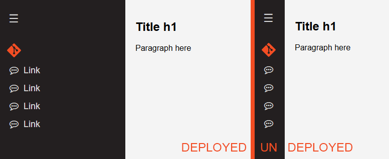](https://nnsprod.com/cloud/s/EMmKxq3kxi6HfB8)
|
|
|
|
Additional previews: [expanded sidebar](https://nnsprod.com/cloud/s/dMXXy6mtBDe6r82) · [compact sidebar](https://nnsprod.com/cloud/s/54dCLeyE5RnyHgN)
|
|
|
|
## Features
|
|
|
|
- collapsible navigation controlled entirely by CSS;
|
|
- separate top and bottom menu areas;
|
|
- compact icon-only state and expanded label state;
|
|
- content offset that follows the sidebar width;
|
|
- responsive adjustments for tablets and phones;
|
|
- easy-to-replace links, labels and logos.
|
|
|
|
## Quick start
|
|
|
|
Clone the repository, then open `menu.html`:
|
|
|
|
```bash
|
|
git clone https://nnsprod.com/git/oversu/html5-css3-sidebar-menu-without-javascript.git
|
|
cd html5-css3-sidebar-menu-without-javascript
|
|
```
|
|
|
|
No dependency installation or build step is required. You can also serve the demonstration locally:
|
|
|
|
```bash
|
|
python3 -m http.server 8080
|
|
```
|
|
|
|
Then visit <http://localhost:8080/menu.html>.
|
|
|
|
## How it works
|
|
|
|
The checkbox must appear before the sidebar and content because the CSS uses the general sibling selector (`~`):
|
|
|
|
```html
|
|
<input type="checkbox" id="toggle-sidebar" hidden>
|
|
|
|
<nav class="sidebar close">
|
|
<label for="toggle-sidebar" class="toggle" aria-label="Toggle navigation">☰</label>
|
|
|
|
<div class="menu top-menu">
|
|
<ul>
|
|
<li>
|
|
<a href="#">
|
|
<i class="fa fa-commenting-o" aria-hidden="true"></i>
|
|
<span>Link</span>
|
|
</a>
|
|
</li>
|
|
</ul>
|
|
</div>
|
|
</nav>
|
|
|
|
<main class="content">
|
|
<!-- page content -->
|
|
</main>
|
|
```
|
|
|
|
When the checkbox is checked, these rules expand the navigation and move the content:
|
|
|
|
```css
|
|
#toggle-sidebar:checked ~ .sidebar {
|
|
width: 250px;
|
|
}
|
|
|
|
#toggle-sidebar:checked ~ .content {
|
|
margin-left: 250px;
|
|
}
|
|
```
|
|
|
|
Edit the dimensions and colours in `style.css` to match your layout. Menu entries can be added or removed independently in `.top-menu` and `.bottom-menu`.
|
|
|
|
## Project structure
|
|
|
|
```text
|
|
menu.html Demonstration markup
|
|
style.css Sidebar states and responsive presentation
|
|
logo.png Example logo used by the menu
|
|
LICENSE Apache License 2.0
|
|
```
|
|
|
|
## Browser and implementation notes
|
|
|
|
- Font Awesome 4.7 is imported from an external CDN for the example icons.
|
|
- The stylesheet uses `:has()` for one logo-specific rule; current evergreen browsers support it.
|
|
- A hidden `toggle-dark-mode` checkbox and a few related selectors remain in the demonstration stylesheet, but no visible dark-mode control is currently wired in `menu.html`.
|
|
- Replace placeholder links and alternative text before integrating the component into a real site.
|
|
|
|
## License
|
|
|
|
Distributed under the Apache License 2.0. See [LICENSE](LICENSE) for the complete terms.
|